Discontinued Product Page
A product page for retired products to enhance user experience and SEO value.
Background
Overview
As new products launch and old ones are discontinued (end-of-life), the popularity of discontinued products may still be high. It is important to preserve their product page for SEO value and prevent users from ending their journey on the site upon learning it is not available.
This project originated from SEO Manager to initiate the design of a discontinued product page. As the UX Designer, I worked closely with a UI Designer and UX Writer. We focused primarily on the discontinued Roadie 20 Hard Cooler for this project.
Problem
Although the site completed a full redesign in early 2022, discontinued product pages were not on the project roadmap. If users were to search for a discontinued product (on the site or on Google), none or other products will appear in the search results. This is a poor experience for users unable to find what they are seeking and will feel overwhelmed with other results.
Objective
Create a discontinued product page template to balance product value and user satisfaction
Success Metrics
Research
To understand what methods are currently used to help users alleviate the news of unavailable products, I researched brands in the market with notes on the pros and cons of each brand.
REI
REI product page includes a notification to inform the user the product is no longer available. The banner includes a link to the new product. However, the message is repeated in the product details and does not motivate users.
Dyson
Dyson provides clear messaging on unavailable products with top banner and description details. However, inconsistent next steps can confuse users and create fatigue.
Patagonia
Patagonia’s out-of-stock message is clear and concise. Not only do they note the back-in-stock date but they also provide users the opportunity to join the waitlist to be notified once it is back online.
Best Buy
Best Buy keeps a comprehensive product page where users can view images, reviews, and FAQ’s. However, the recommended products are located at the bottom of the page and can be easily missed.
1.
A clear message of the unavailable product.
2.
Redirect or recommend new/similar products.
3.
Product details to set value and enhance SEO.
4.
Opportunity for user to be notified when the product is back.
Research Findings
Brainstorm
Using research insights, we brainstormed ideas for reasons & user motivations to seek out discontinued items. Looking into the reasons helps me pinpoint ‘How might we’ questions and focus on the problems we want to solve.
New User
Customers looking to purchase a YETI product.
Returning User
Current users with questions about the product.
Returning User
Current users looking to purchase accessories.
How might we
communicate effectively and ease concerns about unavailable products?
How might we
help users locate relevant product information?
How might we
direct users to products and accessories?
Sketches
From the brainstorming session and How might we questions, I started to sketch ideas and methods for solutions. This will help guide us on the best design decision.
Initial Concepts
Exploration
We explored different concepts and methods to tackle our goal. These are some initial designs we pursued and did not proceed forward with.

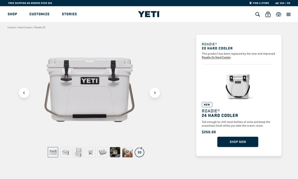
We wanted to try promoting the available item on the Buy Box, but it visually was a busy and text-heavy section where the unavailable messaging would be lost.

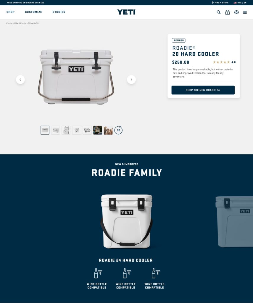
We considered using a visual method with icons to promote the product family’s benefits and use cases, alongside a Shop button in the Buy Box. Although it was a great method to highlight products, with technical constraints and needed time to create a new design component, we did not proceed with this design.

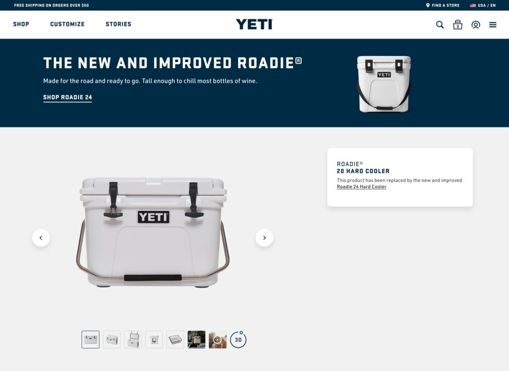
We attempted to use a top banner to visually showcase the available product and highlight its advantages. Although it is emphasized, it was visually heavy in brand color and does not seem encouraging for users to explore the new product.
High-Fidelity Designs
Solutions
From the sketches and various ideas exploration, we decided upon the following highlighted features that can provide answers for users and our ‘How might we’ questions.
New product highlight
The available product is shown at the top of the discontinued product page. The product card will transition to a sticky as users begin to scroll to prevent users from missing it.
Convey the right message
A badge label is added to the discontinued product title to support the message copy that highlights both products.
Expose similar products
In addition to highlighting the available product, we added the recommended product family to show similar products and provide a comparison among the collection.
Link to product answers
In the overview section, users can access the link to the product’s frequently asked questions page for those who seek additional information.
High-Fidelity Designs
Desktop
Since there isn’t an app, I created desktop versions to ensure there is a balance with responsive page designs.
Challenges
Working with a UX writer and UI Designer, we know there isn’t a one size fits all method and we tackled problems like:
Sunsetted product details
With the site redesign, discontinued product details were not migrated to the new platform. To show users they are on the page, we needed to decide which details are valuable to include.
Communication is key
We know being unable to find what you are searching for can be frustrating. We want to soften the message of the unavailable product and translate it into exciting news that there is a replacement. To do so, I worked closely with a UX writer to ensure this transition will be smooth.
Impact
The discontinued product page will not only help balance the transition in user perspective between products and allow the business to capture data on product demand.
Reflections
Learnings
It was a great experience creating my first discontinued product page because I learned to switch perspectives on user and business needs between active & discontinued products and explore the impact they provide.
What would I do differently?
- If time permits, and data reveal an increase in user searches for discontinued products, additional user research can be performed to measure needs and behavior on the page.
- Perform a usability test on the recent version to review improvements and if content can be included on active product pages for a test.
- Communicate about technical constraints and time/need for new design components to explore various design solutions.